Portrait In Vectors

Here's the rest of that portrait I showed you in my last post.  Click the image for a larger view.


Here are my initial sketches.


This is a private commission so I worked very closely with the client to make sure I captured the essence of his loved ones as he sees them.  You can see that there were a few tweaks to the attire and especially the little boy's face shape.  What a great experience!  Shout out to my client...  Thanks for the great project, Jair!

What's the Value of Art?

Someone in a linkedin discussion asked what is the value of making art other than making money.  This got me thinking and I responded with this:
Aside from making money, the value of art is in developing and sharing ideas and emotions.  The medium helps dictate the sort of thought and emotion that can be explored, so the medium itself helps develop new ways of thinking of things.  And this is valuable because it's important to grow and learn and broaden our perspective to make us more savvy decision makers and action takers.
For instance, drawing in vectors makes me think differently than drawing in brush and ink.  I become more methodical and analytical.  Drawing in brush and ink is more intuitive and immediate.  This vector portrait I just made actually comes out looking more soft and natural looking than my ink drawings do, even though the vector image is made completely of hard edge shapes and my ink drawings are made of organic hand made brush strokes.  How ironic!

Amanda Sussman Portrait Process

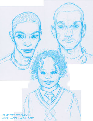
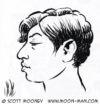
In 2010 I was asked to contribute 12 portraits to the TEDx Toronto Conference.  Being a big fan of the TED talks I was thrilled to accept.  This was the first portrait I worked on so it went through the most revision as I worked to establish the style.  Even so, the style shhifted a bit from one image to the next so each of these is similar but not the same in regards to the cartoony:realistic ratio.  I started with a quick doodle that looks very little like the actual Amanda Sussman.  I didn't even really study her photos for this one.  I wanted to see what impression my imagination would come up with.


Then another one using this great photo for reference... my drawing looks more like her now but still not quite.


Then build the vectors...


Then my wife Trina says "That's not very flattering for her" and I futilely try to argue that it is flattering until I inevitably cave and redo it to get the version below.


 ... Which is not the final version but now looking back I think it's the better one.  This image set the foundation to my approach to all the rest of the portraits, but in the end it was so different from all the rest I chose to completely redo the face and hair to blend in with the rest of the images.

So, another sketch and another vector rendering.


I usually make my characters up out of my imagination, which has it's own conventions, so it took a few tries to get the hang of quickly capturing the likenesses of real people.  The images got less and less cartoony as I worked my way through them.  By the end I had become very economical with my process and the likenesses got better and better, plus the final results started looking more and more refined.

Bike Boxes

This project was for the City of Guelph as part of it's traffic management experiment with bicycle boxes... a painted box on the road where cars allow bicycles to cross into the intersection for a left turn, or to wait at a red light with some breathing room.  All vector, no hand drawn elements.  Squeaky clean. Notice a bit of distorted perspective... I had to fit those traffic lights in and the road markings in this letterbox space.  This is why illustrated information design often works better than photography.  We're not limited by literal reality.

Properties of Silicone

CSL Silicones in Guelph Ontario asked me to create illustrated information design to help them clarify the attributes of their various products.  I proposed including some emotional content to add a new layer of information in a simple and visual manner by putting cute little emotional expressions, similar to emoticons, on some of the  objects.  This allowed me to show more about what an object is doing, or how it's being affected in a general sense.  I also proposed that it would differentiate CSL from the clinical technical illustrations that characterizes most industrial products.  Here are some of my favourites:


TEDx Toronto

Here's a little something I'm super excited about. Being involved in the amazing TEDx Toronto conference. And a new style altogether for me, dong the final rendering completely in vectors... no hand drawing was involved, besides a rough sketch I used as a guide.  There's a total of 12 of these portraits, one of each of this year's TEDx Toronto speakers.


You may not be able to read it here but I used each speaker's bio as the background texture, which I thought was pretty clever :-).

Emotional Freedom Technique Step by Step Comic

Comics are a great information design medium for sequential visual/verbal information.  If you're mostly used to verbal instructions you might think that all information is sequential, but it's not.  A lot of information is best explained spatially.  Emotional Freedom Technique, also known as EFT or Meridian Tapping, is both.  Actually, it's spacial and kinesthetic and verbal and sequential.  Comics works really well for this whole combination of information types.

How to Choose Your Hypothesis Test

This decision tree is a learning aid I designed which is in use at the University of Guelph for a class called "Quantification in Psychology".  This is an introductory statistics class.  Choosing the most appropriate hypothesis test for any particular study is key, and somewhat complex since there are a lot of variables that determine what kind of test will do the trick.  I used a colour coding system and boxes shaped to visually augment and represent the verbal content to make this complex flow chart as readable and memorable as possible.

Watch Your Step!

At our Photo business there is a single step between the main office and the photo studio.  Sometimes there is a wine and cheese event.  This is usually when someone fails to remember that this step exists.  We've cleaned up a fair bit of wine off the floors, walls, desks, pen holders, etc.  So we thought having me design this wayfinding signage would help.  So far so good!


As you can see they are designed to alert people from each side of the step.

Front Door Signage Design

My wife and I have a photography business together.  At the front of the studio right beside the door we have a 2x3 foot sign with the pertinent info.  It was time for a redesign to update the info and improve readability.  I've been excited about flow charts and dotted lines lately so I used some of that visual language to tie together the related information.


You see, our studio actually houses 3 semi separate entities...

1) The photo studio.  This information is all connected by the pink dotted lines.

2) Flo (our shooting space is also a dance studio so we make it available for rent and we call that part of the studio "Flo").

3) Me.  My illustration, info design and graphic design services.  My illustration and design studio isn't literally in that space, but I often am and I get to have a bit of free promo out of the deal.  Hooray for free promo!

Game Map, Splinter Cell Cargo Ship Upper Deck

My guilty pleasure is video games.  I love figuring things out.  And I'm extremely patient.  Ubisoft's game "Tom Clancy's Splinter Cell" is a first person game requiring a lot of patience as you sneak around trying to avoid being detected by the guards.  This level takes place on a cargo ship.  To plan my strategy and keep from getting disoriented in the secret passageways at the beginning of the level I mapped the space.  Drawing this map was as much fun as playing the game!

Cervical Traction Exercises

My chiropractor sorely needed some good illustration to effectively communicate the correct usage of this traction device.  Words alone don't effectively show it, and a live demo is critical but it's easy to forget little details.  The illustration they were using before was very rudimentary and didn't really read very well and I thought it could use a second part to clarify some other information.  So I volunteered my illustrated information design services to make something really clear.  Ever see something that you know you could vastly improve and you just itch to fix it?  Well, that's what I did here.  They loved it.

"How to Edit Your Photos" Cheat Sheet

Photographer Trina Koster asked me to create an easy reference guide, laminated on a handy 8.5x11" card, so that her clients could use it to edit their own photos on Trina's photo management software.  This may look boring to most of you unless you use Aperture to manage your photos, in which case I'm sure you'll find it fascinating!  Oddly enough I found it totally fascinating to create this, because I get obsessive about developing the most effective information design possible.  I think it's the gamer in me.  I'm always trying to find the best, most effective way to accomplish something, or to communicate something.

Info Design Saves Many, Many Thousands of Lives, London, 1866.

One little bit of information design created in 1854 changed conventional thinking in a way that stopped the London cholera outbreak of 1866, saving hundreds of thousands of lives, and preventing any more outbreaks since.  Dr. John Snow and a minister named Henry Whitehead did a study and mapped their findings to prove Dr. Snow's hypothesis that Cholera was a waterborne disease.  As a result the government changed their policy and their communications to the public, sparing countless hundreds of thousands of lives by stopping the next outbreak and preventing any further outbreaks.

This little piece of information design is Dr. Snow's map indicating the number of deaths in proximity to a particular drinking water well on Broad Street (indicated with an X).  This "ghost map" was a key element, a linchpin, that finally convinced bureaucrats and doctors alike that cholera was spread via drinking water.  This bit of knowledge taught the Western world about the importance of sanitation in cities, which is what allows major cities to even exist at all today.  I learned about it from this great TED Talk by Steven Johnson.  Click here to check it out.  It's about 10 minutes long.

Elizabesque Hottie

I've always loved the pictures of beautiful women made by great concept artists and fantasy artists, so full of texture and costume design. I've always wanted to be able to draw like that but always ended up falling back on my cartoony habits. The cure? Quick drawings on toothy paper with a stumpy, blade-sharpened pencil. Added some tone and texture in photoshop with some cool brushes I found.

I also needed to let go of any concern about historical accuracy, so this outfit is just made up by my uneducated random ideas of what an ornate Elizabethan outfit might look like. History buffs can laugh and point all they want;-).

Yet another blotter Doodle

I've said it before... Some of my favorite pictures are the ones I draw as a way of blotting off excess ink from my brush three or four strokes at a time to test the consistency of the ink before comitting the brush to the real drawing I'm working on. Usually it ends up being a profile portrait of a made up character just like this. This one came off my brush last night as a side effect of inking two crisp and clean images for Paul and Layne Cutright's new course called "The Relationship Codes".